Plot age-sex distribution of a lab
ln_plot_dist.RdPlot age-sex distribution of a lab
ln_plot_dist(
  lab,
  quantiles = c(0.03, 0.1, 0.15, 0.25, 0.35, 0.65, 0.75, 0.85, 0.9, 0.97),
  reference = "Clalit",
  pal = c("#D7DCE7", "#B0B9D0", "#8997B9", "#6274A2", "#3B528B", "#6274A2", "#8997B9",
    "#B0B9D0", "#D7DCE7"),
  sex = NULL,
  patients = NULL,
  patient_color = "yellow",
  patient_point_size = 2,
  ylim = NULL,
  show_reference = TRUE
)
Arguments
- lab
the lab name. See
LAB_DETAILS$short_namefor a list of available labs.- quantiles
a vector of quantiles to plot, without 0 and 1. Default is
c(0.03, 0.1, 0.15, 0.25, 0.35, 0.5, 0.65, 0.75, 0.85, 0.9, 0.97). Note that ifreference="Clalit-demo", quantiles below 0.05 and above 0.95 would be rounded to 0.05 and 0.95 respectively, and the same would be done for quantiles below 0.01 and above 0.99 when the high-resolution version is available.- reference
the reference distribution to use. Can be either "Clalit" or "UKBB" or "Clalit-demo". Please download the Clalit and UKBB reference distributions using
ln_download_data().- pal
a vector of colors to use for the quantiles. Should be of length
length(quantiles) - 1.- sex
Plot only a single sex ("male" or "female"). If NULL -
ggplot2::facet_gridwould be used to plot both sexes. Default is NULL.- patients
(optional) a data frame of patients to plot as dots over the distribution. See the
dfparameter ofln_normalize_multifor details.- patient_color
(optional) the color of the patient dots. Default is "yellow".
- patient_point_size
(optional) the size of the patient dots. Default is 2.
- ylim
(optional) a vector of length 2 with the lower and upper limits of the plot. Default would be determined based on the values of the upper and lower percentiles of the lab in each age.
- show_reference
(optional) if TRUE, plot two lines of the upper and lower reference ranges. Default is TRUE.
Value
a ggplot2 object
Examples
set.seed(60427)
# \donttest{
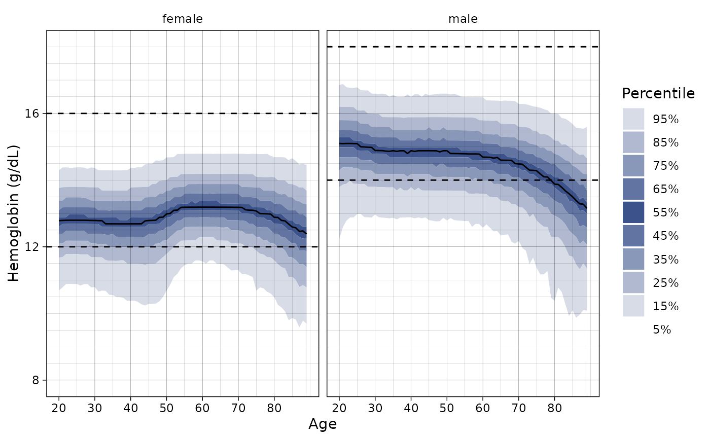
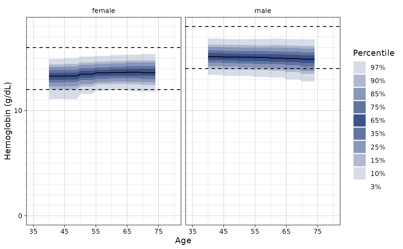
ln_plot_dist("Hemoglobin")
 # Plot only females
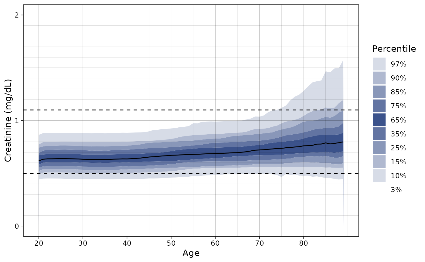
ln_plot_dist("Creatinine", sex = "female", ylim = c(0, 2))
# Plot only females
ln_plot_dist("Creatinine", sex = "female", ylim = c(0, 2))
 # Set the ylim
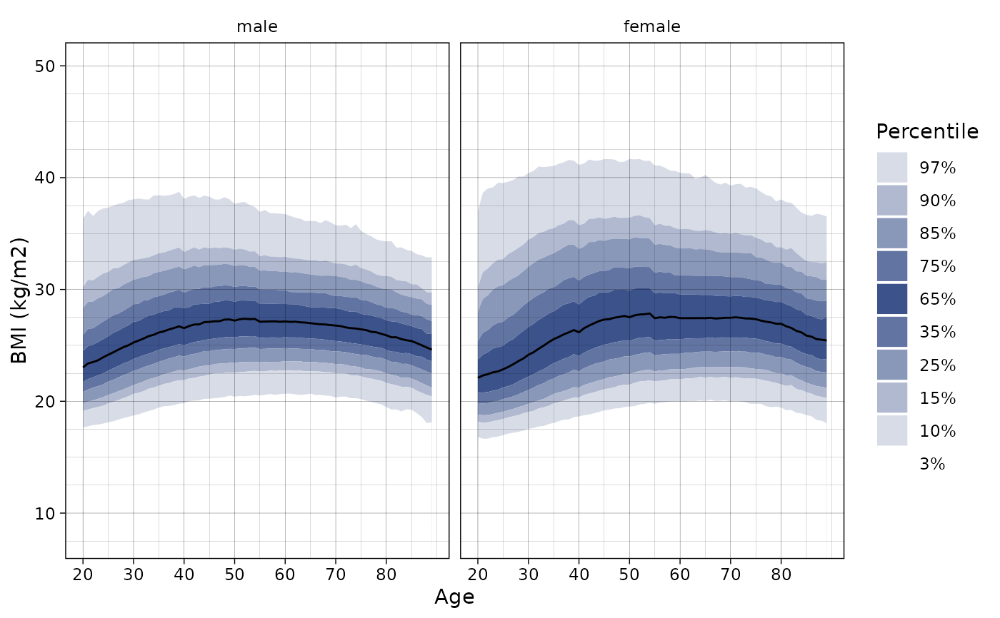
ln_plot_dist("BMI", ylim = c(8, 50))
# Set the ylim
ln_plot_dist("BMI", ylim = c(8, 50))
 # Project the distribution of three Hemoglobin values
ln_plot_dist("Hemoglobin", patients = dplyr::sample_n(hemoglobin_data, 3))
# Project the distribution of three Hemoglobin values
ln_plot_dist("Hemoglobin", patients = dplyr::sample_n(hemoglobin_data, 3))
 # Change the quantiles
ln_plot_dist("Hemoglobin",
quantiles = seq(0.05, 0.95, length.out = 10)
)
# Change the quantiles
ln_plot_dist("Hemoglobin",
quantiles = seq(0.05, 0.95, length.out = 10)
)
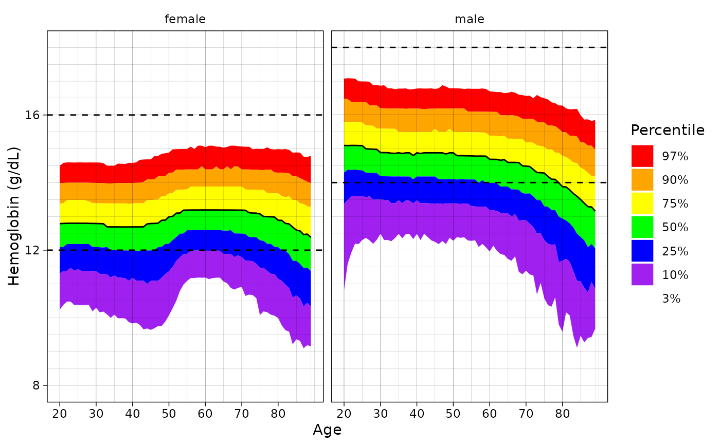
 # Change the colors
ln_plot_dist(
"Hemoglobin",
quantiles = c(0.03, 0.1, 0.25, 0.5, 0.75, 0.9, 0.97),
pal = c("red", "orange", "yellow", "green", "blue", "purple")
)
# Change the colors
ln_plot_dist(
"Hemoglobin",
quantiles = c(0.03, 0.1, 0.25, 0.5, 0.75, 0.9, 0.97),
pal = c("red", "orange", "yellow", "green", "blue", "purple")
)
 # Change the reference distribution
ln_plot_dist("Hemoglobin", reference = "UKBB")
#> Warning: Removed 220 rows containing non-finite values (`stat_align()`).
#> Warning: Removed 11 rows containing missing values (`geom_line()`).
# Change the reference distribution
ln_plot_dist("Hemoglobin", reference = "UKBB")
#> Warning: Removed 220 rows containing non-finite values (`stat_align()`).
#> Warning: Removed 11 rows containing missing values (`geom_line()`).
 # }
# on the demo data
# \dontshow{
p <- ln_plot_dist("Hemoglobin", reference = "Clalit-demo")
# }
# }
# on the demo data
# \dontshow{
p <- ln_plot_dist("Hemoglobin", reference = "Clalit-demo")
# }