This geom creates a scatter plot where points are colored by their local density, using a custom color gradient.
geom_dense_scatter(
  mapping = NULL,
  data = NULL,
  stat = "DenseScatter",
  position = "identity",
  na.rm = FALSE,
  show.legend = NA,
  inherit.aes = TRUE,
  pal = NULL,
  size = 0.8,
  alpha = 1,
  ...
)
Arguments
- mapping
Set of aesthetic mappings created by
aes- data
The data to be displayed in this layer
- position
Position adjustment, either as a string, or the result of a call to a position adjustment function
- na.rm
If
FALSE, the default, missing values are removed with a warning. IfTRUE, missing values are silently removed- show.legend
logical. Should this layer be included in the legends?
NA, the default, includes if any aesthetics are mapped- inherit.aes
If
FALSE, overrides the default aesthetics, rather than combining with them- pal
Color palette. A vector of colors to use for the density gradient, from lowest to highest density
- size
Point size
- alpha
Point alpha/transparency
- ...
Other arguments passed on to
layer
Value
A ggplot2 layer that can be added to a plot
Examples
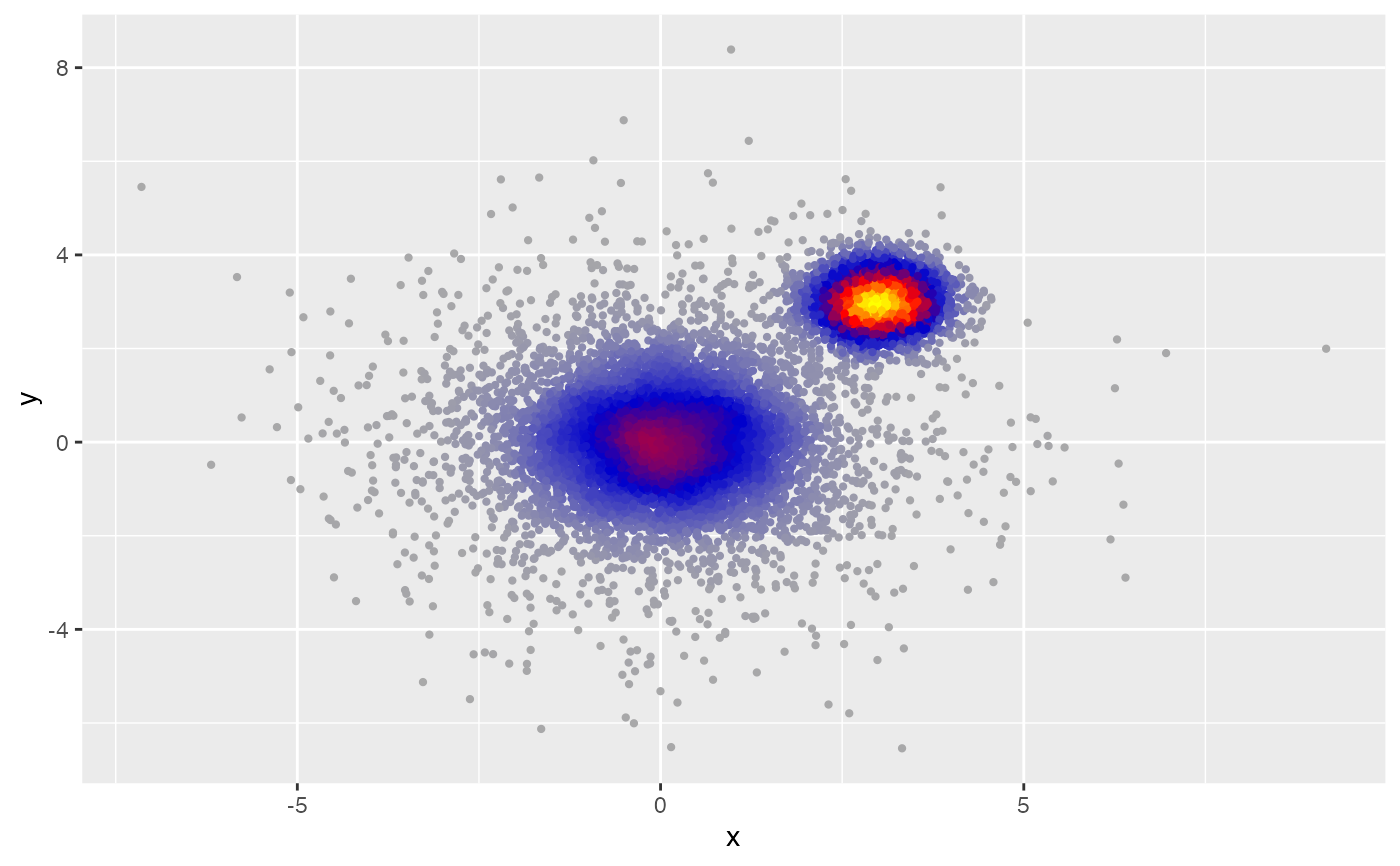
# Create large dataset with multiple clusters
library(ggplot2)
#> Want to understand how all the pieces fit together? Read R for Data
#> Science: https://r4ds.hadley.nz/
set.seed(60427)
n <- 1e4
df <- data.frame(
x = c(rnorm(n * 0.5), rnorm(n * 0.3, 3, 0.5), rnorm(n * 0.2, 0, 2)),
y = c(rnorm(n * 0.5), rnorm(n * 0.3, 3, 0.5), rnorm(n * 0.2, 0, 2))
)
# Basic usage with default settings
ggplot(df, aes(x, y)) +
geom_dense_scatter()
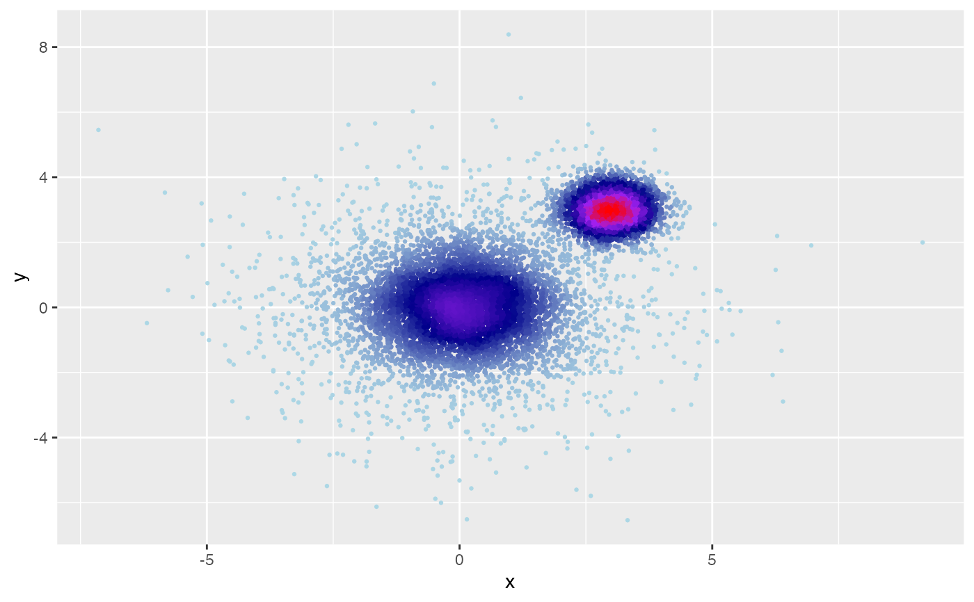
 # Custom color palette to highlight density variations
ggplot(df, aes(x, y)) +
geom_dense_scatter(
pal = c("lightblue", "darkblue", "purple", "red"),
size = 0.5
)
# Custom color palette to highlight density variations
ggplot(df, aes(x, y)) +
geom_dense_scatter(
pal = c("lightblue", "darkblue", "purple", "red"),
size = 0.5
)
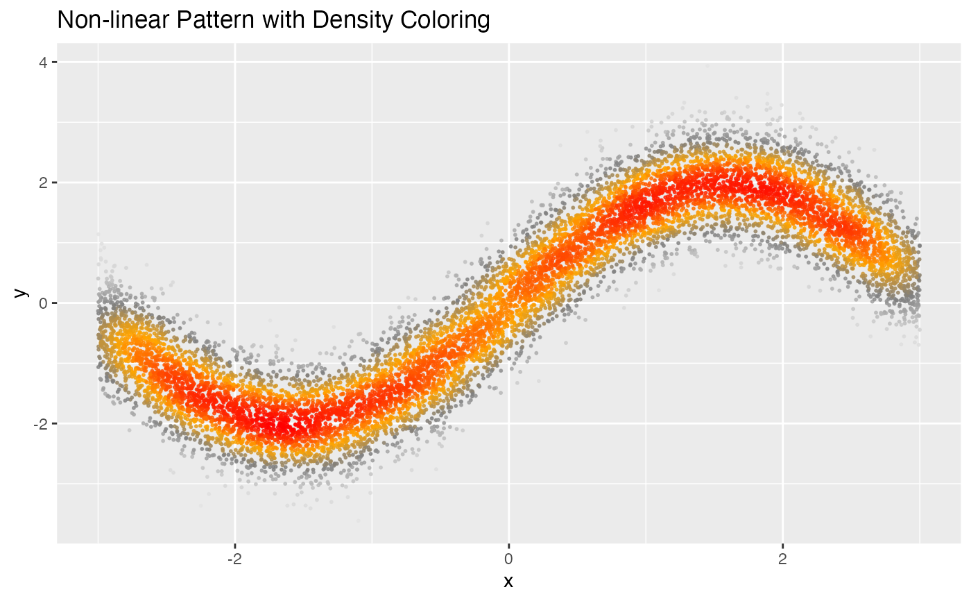
 # Create large dataset with non-linear relationship
x <- runif(n, -3, 3)
df2 <- data.frame(
x = x,
y = sin(x) * 2 + rnorm(n, 0, 0.5)
)
# Visualize non-linear relationship with density
ggplot(df2, aes(x, y)) +
geom_dense_scatter(
pal = c("gray90", "gray50", "orange", "red"),
size = 0.4,
alpha = 0.8
) +
labs(title = "Non-linear Pattern with Density Coloring")
# Create large dataset with non-linear relationship
x <- runif(n, -3, 3)
df2 <- data.frame(
x = x,
y = sin(x) * 2 + rnorm(n, 0, 0.5)
)
# Visualize non-linear relationship with density
ggplot(df2, aes(x, y)) +
geom_dense_scatter(
pal = c("gray90", "gray50", "orange", "red"),
size = 0.4,
alpha = 0.8
) +
labs(title = "Non-linear Pattern with Density Coloring")
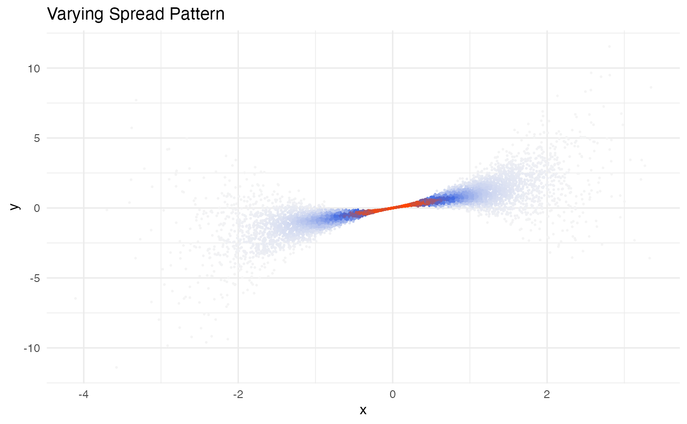
 # Create large dataset with varying spread
x <- rnorm(n)
df3 <- data.frame(
x = x,
y = x * rnorm(n, mean = 1, sd = abs(x) / 2)
)
# Visualize heteroscedastic pattern
ggplot(df3, aes(x, y)) +
geom_dense_scatter(
pal = c("#F5F5F5", "#4169E1", "#FF4500"),
size = 0.3
) +
theme_minimal() +
labs(title = "Varying Spread Pattern")
# Create large dataset with varying spread
x <- rnorm(n)
df3 <- data.frame(
x = x,
y = x * rnorm(n, mean = 1, sd = abs(x) / 2)
)
# Visualize heteroscedastic pattern
ggplot(df3, aes(x, y)) +
geom_dense_scatter(
pal = c("#F5F5F5", "#4169E1", "#FF4500"),
size = 0.3
) +
theme_minimal() +
labs(title = "Varying Spread Pattern")